
Economics is not static; a changing world causes shifts in prices and economic relationships. This is captured best by an evolving geopolitical landscape that redefines things we take for granted, be it trade relations or global supply chains.
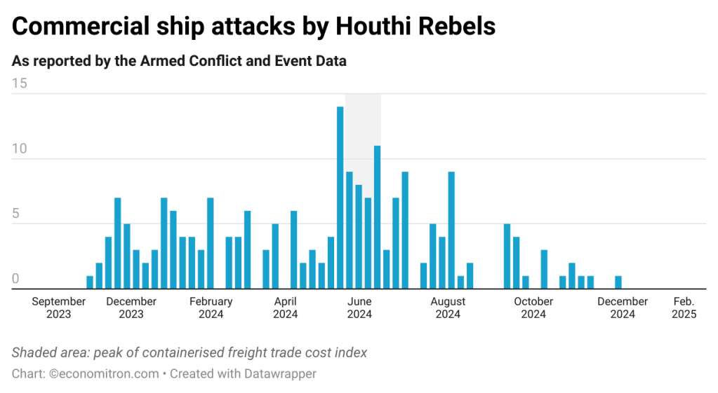
In January, this blog briefly touched upon one such example of disruptions to the status quo. Attacks against shipping vessels in the Gulf of Aden off the coast of Yemen were then responsible for an almost fivefold rise in shipping costs from Europe to Asia. The Red Sea is of course one of the busiest shipping routes in the world, with a third of global container trade passing through the 200m-narrow canal.
Attacks increased significantly in the span of 2024, peaking in June of last year before lulling towards zero. They have only resurged against civilian ships as of these weeks. Apart from the physical risk faced by crewmembers, disruptions throw a wrench in well-oiled global supply chains. This carries risks of cost-push inflation due to rising freight costs: cargo companies must opt between higher insurance premiums & security measures or taking a 7-day reroute around the Cape of Good Hope.
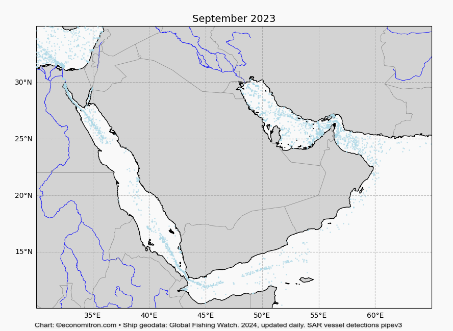
Out of curiosity, I wanted to visualise this shock to supply chains that last year had central bankers teetering in following developments closely -territory. To do so, I enlist the help of OpenStreeMap‘s mapping tools and satellite imagery data from Global Fishing Watch. Radar detections are matched with known maritime records of ships to estimate the coordinates and likely characteristics of vessels (eg. length; fishing, cargo etc.).
With a bit of tuning, this gives us an overview of snapshots of vessel locations during different months. In this case we look at the greater Arabian Sea region, encompassing the Persian Gulf, the Gulf of Aden and the Red Sea.
The chart below plots cargo ship sightings, which will serve as a proxy for trade volume. This includes oil tankers. The animation begins in September of 2023, before attacks on commercial ships were carried out (as the chart above states). It then displays developments in maritime traffic until July of 2024.
As expected, a pronounced fall in traffic can be observed. February and July saw the lowest amount of ship movement, also coinciding with intensifications of attacks. Things begin a return to normalcy from January 2025 onwards.
Visualising current events in such a way serves as a powerful reminder of what goes on behind news headlines. Prices in supermarket shelves reflect many mechanical relationships between real physical variables; being able to attest to those changes by using open source tools is remarkably satisfying. It also validates the conviction that beyond textbooks, economics is often far more tangible than what meets the eye.

Leave a comment